Project Summary
Ernst & Young, a global accounting firm tasked us with designing an internal website that would help their 300,000 employees manage EY-provided computer hardware, electronics, and peripherals in four different scenarios.
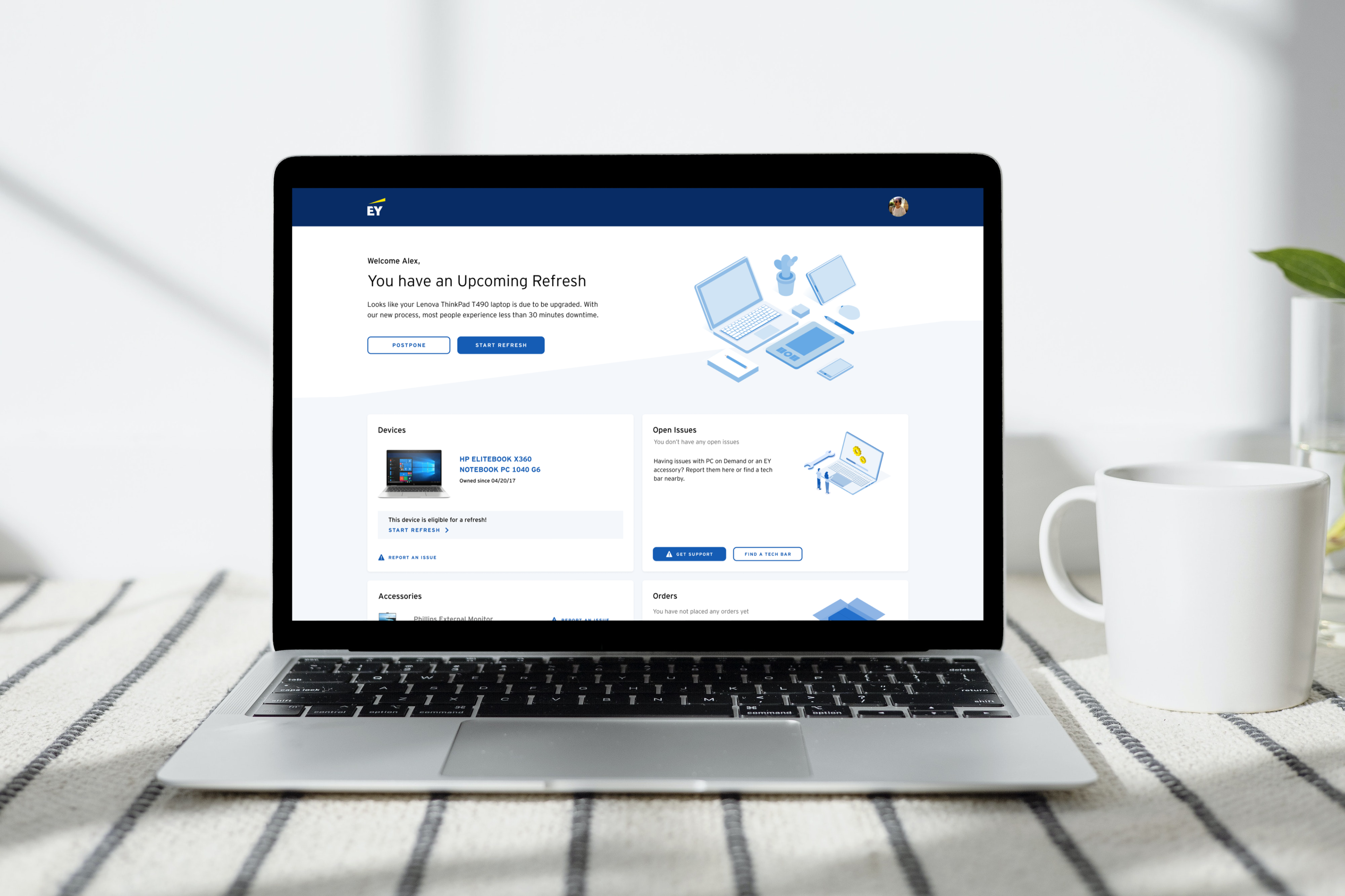
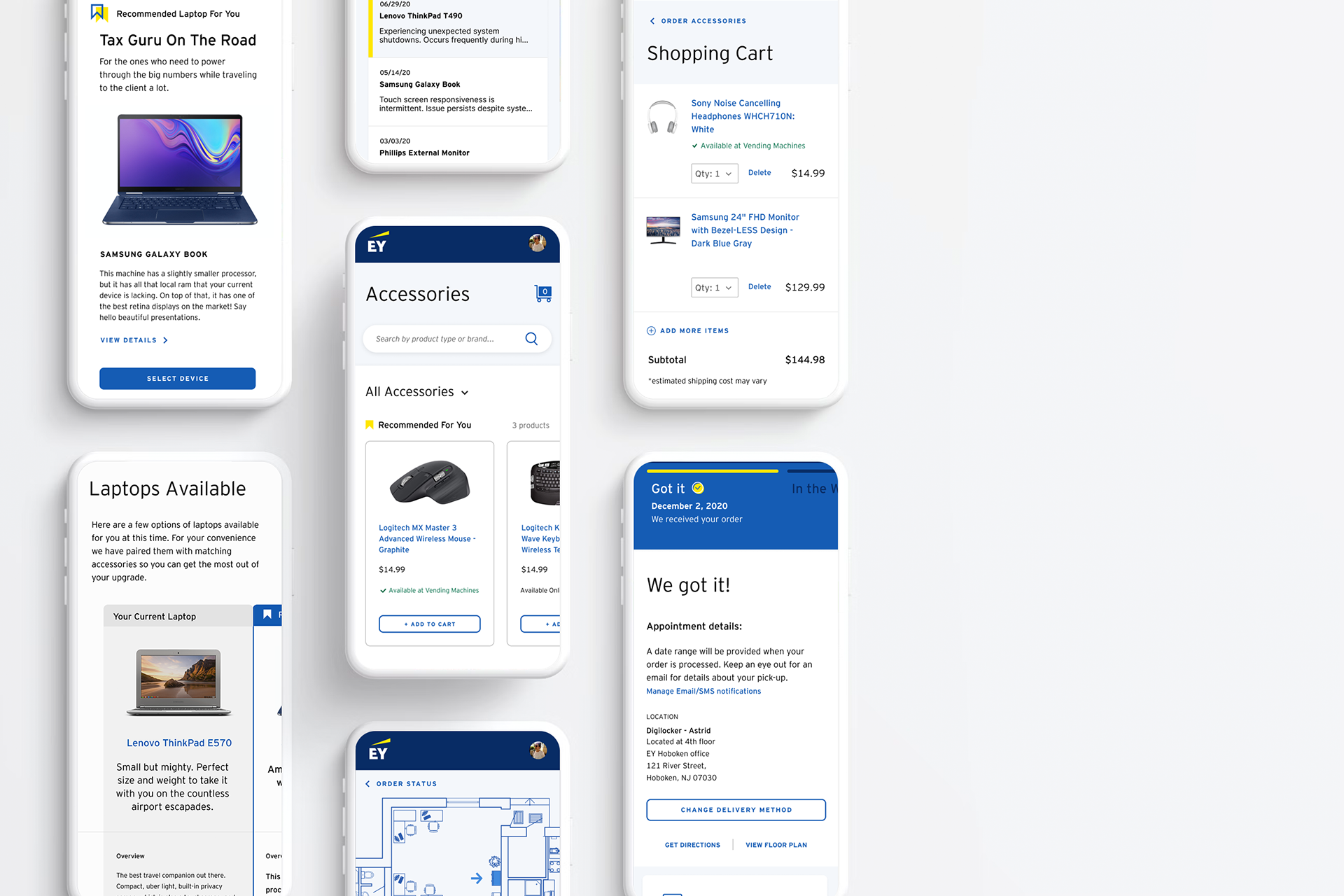
Of the four scenarios scoped to be designed, all were accessible by an employee portal/dashboard. The user could perform a series of actions from there, which led to a selection of delivery methods, and ultimately to a confirmation and tracker page.
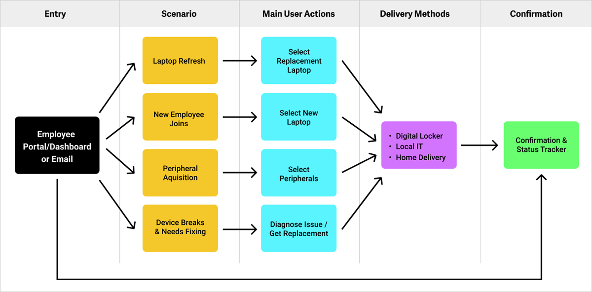
A simplified sitemap of the scoped project.
My Role
I was asked to join the project after the research phase had been completed, and just after the design phase had begun. I would remain on the project full-time, from June 2020 until the project ended in August 2021.
My responsibilities included: conceptual and detailed design, prototyping, visual design, project management, client presentation, creating a design system, collaborating with stakeholders and developers, participating in usability testing, synthesizing research data, creating findings reports, and making recommendations.
Challenges
1. An Inexperienced Client
One of the key stakeholders was unable to comprehend low-fidelity wireframes and as a result, all of the screen designs and flows had to be presented as visual/UI designs.
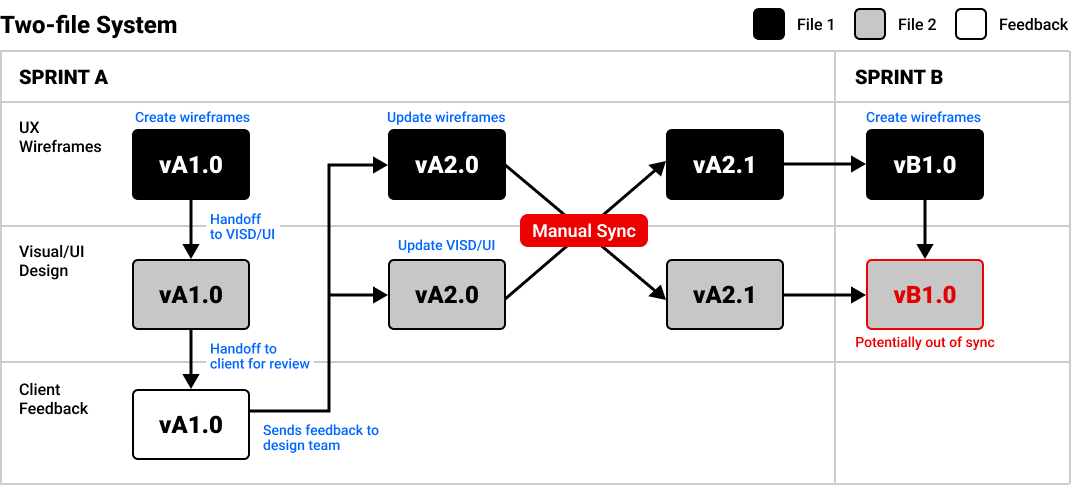
Before I joined the project, the UX, and the Visual Design/UI streams were operating in a two-file system, using Sketch for design and Abstract to keep files synced because we were all working remotely. This was problematic because 3rd party apps, such as Abstract, have a way of failing at the worst possible time. More importantly, the risk of syncing errors between the two wireframes and visual design files was very high because it required an error-prone manual syncing step after receiving client feedback to ensure that both files were updated with the client's requests. See below.
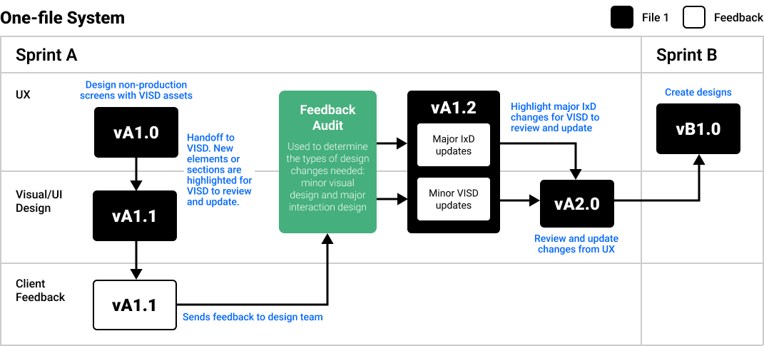
Shortly after joining the project, I convinced our project director, project lead, designers, and the client to switch design platforms from Sketch to Figma midway through the project in order to be able to utilize a one-file system that I devised as a way to solve for the client request to only get presented visual designs, and the syncing and error-prone ways of the two-file system.
This “one file” approach sped up the design process and increased the quality of work by eliminating any chance that there would be syncing errors that could be missed or needed to be corrected.
2. User Testing & Rapid Prototyping
Instead of validating initial concepts with user testing, the client insisted on having testing conducted only at the end of the project. In addition, they wanted to test as many different outcomes as possible, which made the prototypes very large and complex.
Our team had been using Sketch, and InVision for prototyping (another 3rd party app), but the client demands required a more efficient way to make numerous changes on the fly and rapidly prototype hundreds of screens very quickly. These were additional reasons why I advocated for the client and our team to switch over to Figma in order to take advantage of the tool’s remote collaboration and robust prototyping features.
3. High Staff Turnover Rate
Because of the high demands from the client, two-thirds of the design team who were working on the project left while I was on the project.
A high staff turnover meant that new designers were frequently being onboarded and by using a clear and documented communication method coupled with an efficient system for designing and prototyping, we were successfully able to deliver on time and with work that made the client happy.
Although Figma is a great design and prototyping tool, its commenting features are very rudimentary. To address the frequent client feedback and with a rotating cast of designers in remote environments, I implemented a unique system for tracking and completing tasks, without the use of any 3rd party apps.
Process
We used a Kanban board for high-level and global task management, but design feedback can often be quite granular, and when spread out across dozens of screens, would require a different approach.
To manage this, we presented designs to the client in real time with Figma, capturing feedback notes on each screen. This was beneficial in two main ways, which helped mitigate the amount of back-and-forth communication during the feedback cycle:
1. Feedback appeared in context, alongside the design.
2. The client could clarify feedback if a note was not accurate.
2. The client could clarify feedback if a note was not accurate.
To make the management of these requests more efficient, I used color styles to categorize the notes into different statuses to track changes. We intentionally did not remove completed tasks from designs because it helped track changes that were made when the updated designs were presented back to the client.
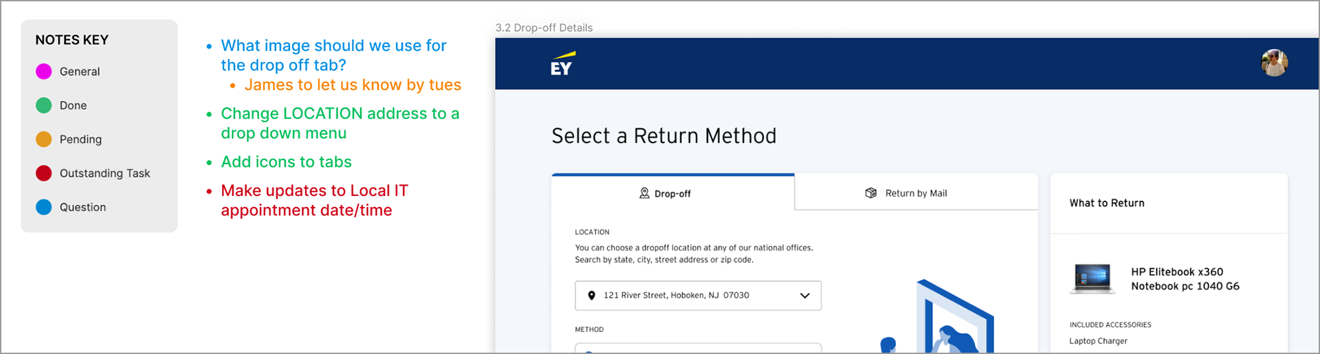
Example of how granular client feedback was managed and tracked.
In addition, I created a robust component library that allowed the team to quickly make changes, which was particularly important given the challenges that we needed to overcome.
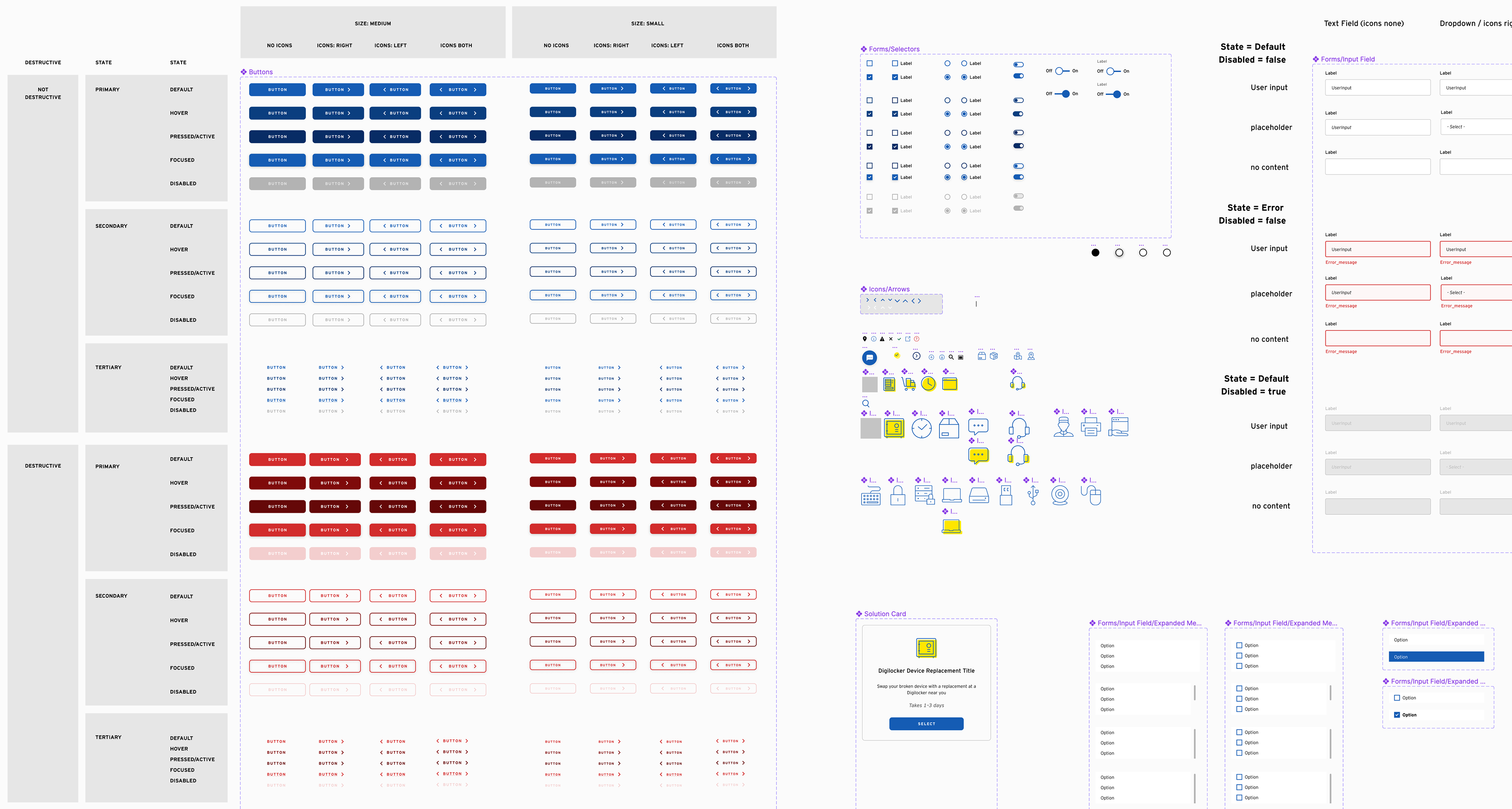
Component library designed for this project
Usability Testing
Over the course of two weeks, we conducted a series of 45-minute, remote, moderated interviews with 38 EY employees divided up among each of the four scenarios, as outlined in the sitemap. The participants, all based in the United States, represented a balanced mix in terms of gender, years of experience with EY, and familiarity with the system. They worked in various service lines, including Global Services IT, Finance, AWS, Management, Audit, Private Client Services, and Tax. The testing was facilitated using static, high-fidelity prototypes of a future product, with no personalization for individual participants. All participants interacted with the prototype on their own desktop or laptop computers, with no mobile screens involved. After being given a task, participants were free to explore the prototype in order to complete it.
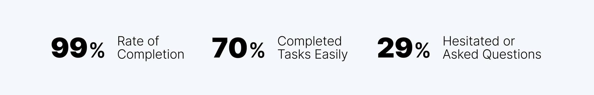
Task Completion Metrics
Each user completed 2-3 scenario-dependent tasks such as:
“It’s been a few business days since you submitted a request for your device and you’ve just received an update on the approval. After being notified of the approval of your request, navigate and submit a delivery method from the hardware portal dashboard”
Among those who encountered difficulties, roughly 3/4 of the issues they experienced were tied to existing business requirements which included:
• A lack of calendar integration with Outlook for scheduled delivery dates.
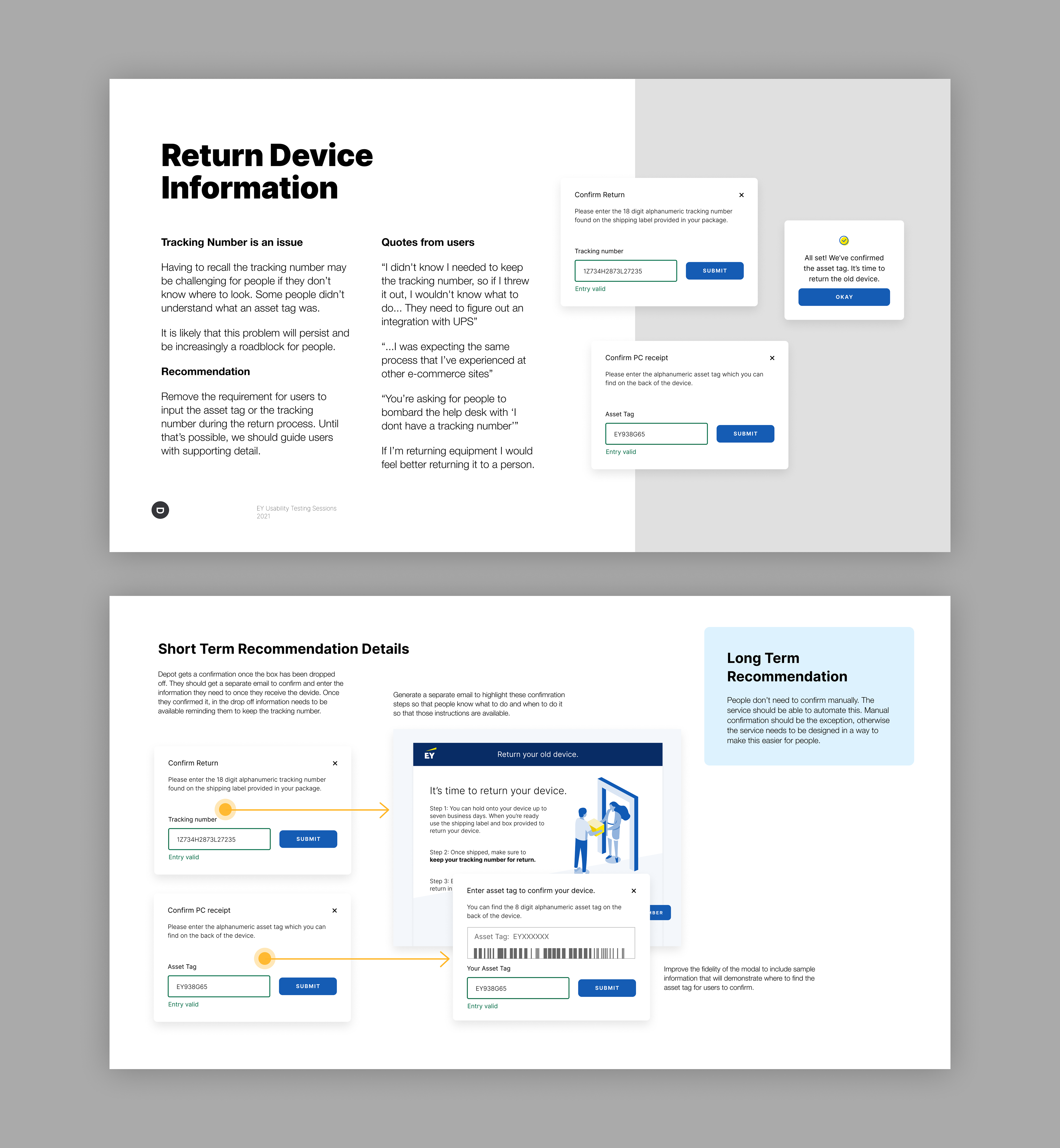
• The need for users to recall a tracking number and asset code to confirm receipt of replacement devices.
• Insufficient marketing and education on Vending Machines and Digilockers which were not rolled out.
• A requirement to include pricing info when ordering peripherals that employees are not paying for.
• The inability of users to select their own replacement devices when dealing with a broken device.
Survey Ratings
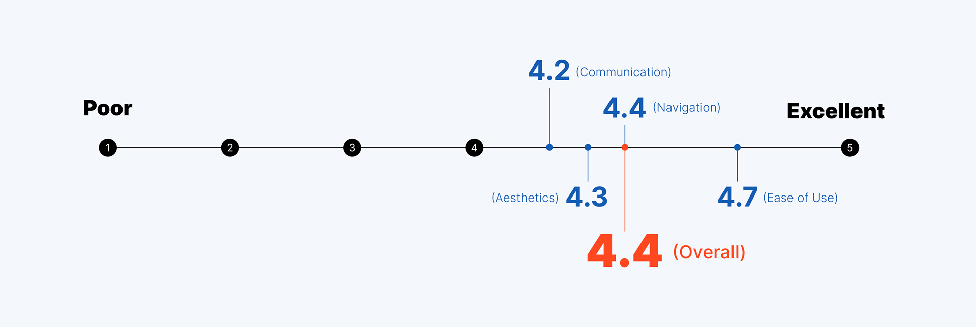
At the end of each session, we asked each user to rate several aspects of the experience on a scale from 1 to 5, which included: clarity of communication and instructions, ease of use, navigation, aesthetics, and the new process compared to their previous experience.
In order to create a holistic metric of all testing sessions, the ratings from Clarity of Communication and Instructions, Ease of Use, Navigation, and Visuals & Aesthetics were averaged across all scenarios to obtain the overall score below:
Recommendations
At the end of the project, we provided the client with four usability testing reports for each scenario that included a recommendations section to address ways to further improve the user experience based on what we learned from the usability testing sessions.